Generate Charts
mcnoaa-tides includes two visualization tools that render NOAA data into charts — a tide prediction plot and a multi-panel conditions dashboard. Both produce PNG (inline image) or HTML (interactive Plotly) output.
Prerequisites
Section titled “Prerequisites”The visualization tools require optional dependencies:
uv pip install mcnoaa-tides[viz]This adds matplotlib (PNG rendering) and plotly (interactive HTML). If the extras are missing, the tools return a clear error with the install command.
Tide chart
Section titled “Tide chart”“Show me the tides for Seattle over the next 48 hours”
The assistant generates a tide chart for station 9447130. The chart plots a smooth water-level curve from 6-minute predictions, marks each high (H) and low (L) turning point, and overlays observed water levels as a dashed comparison trace.
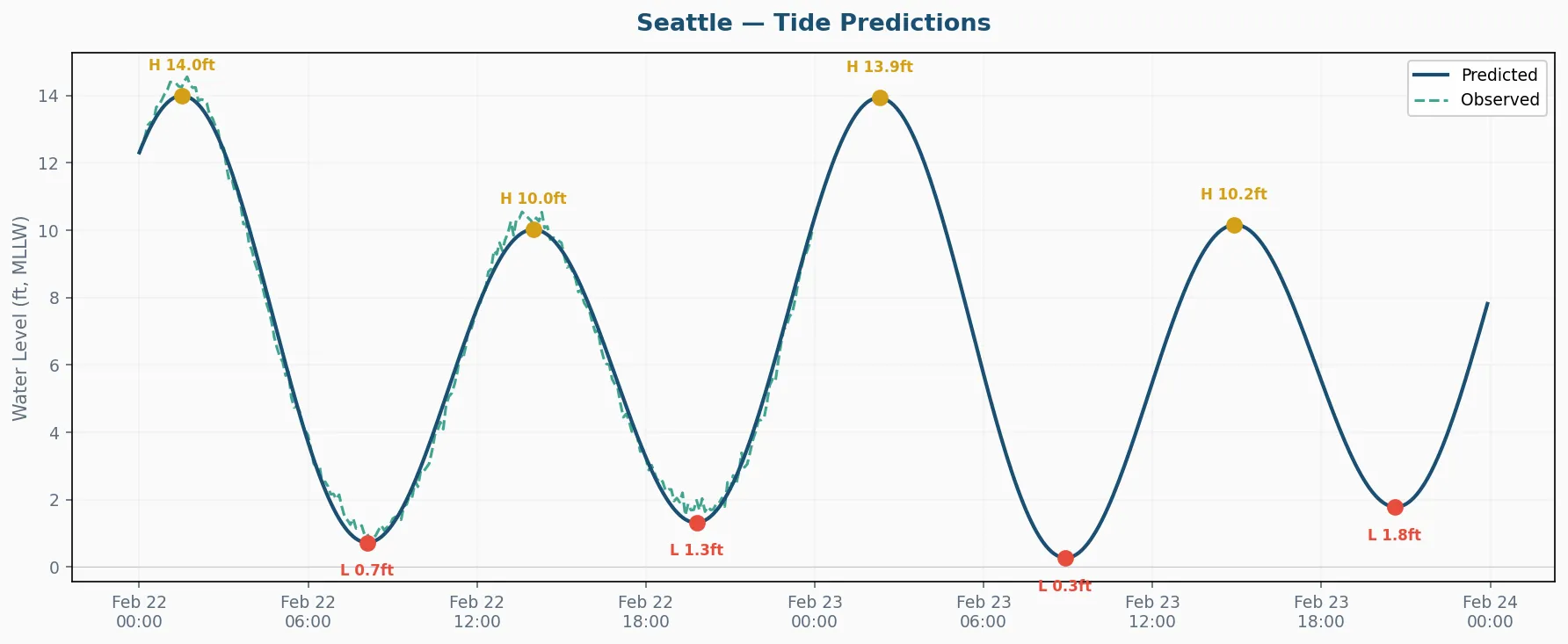
The observed overlay shows how actual conditions compare to the forecast — useful for spotting storm surge or wind-driven deviations. Since NOAA only provides observations for the past, you’ll see the dashed line for the first portion of the chart and predictions alone for the remainder.
The assistant called visualize_tides for station 9447130 with a 48-hour window, observed overlay enabled, and PNG format. The chart appears inline in the conversation.
{ "station_id": "9447130", "hours": 48, "include_observed": true, "format": "png"}Parameters
Section titled “Parameters”| Parameter | Default | Description |
|---|---|---|
station_id | required | 7-digit NOAA station ID |
hours | 48 | Time window for the chart |
include_observed | true | Overlay actual readings as a dashed line |
format | "png" | png (inline image) or html (interactive Plotly) |
Conditions dashboard
Section titled “Conditions dashboard”“Give me a full conditions dashboard for Seattle — I want to see everything”
The assistant generates a multi-panel dashboard showing up to four marine data products side by side: tides, wind, temperature, and barometric pressure.
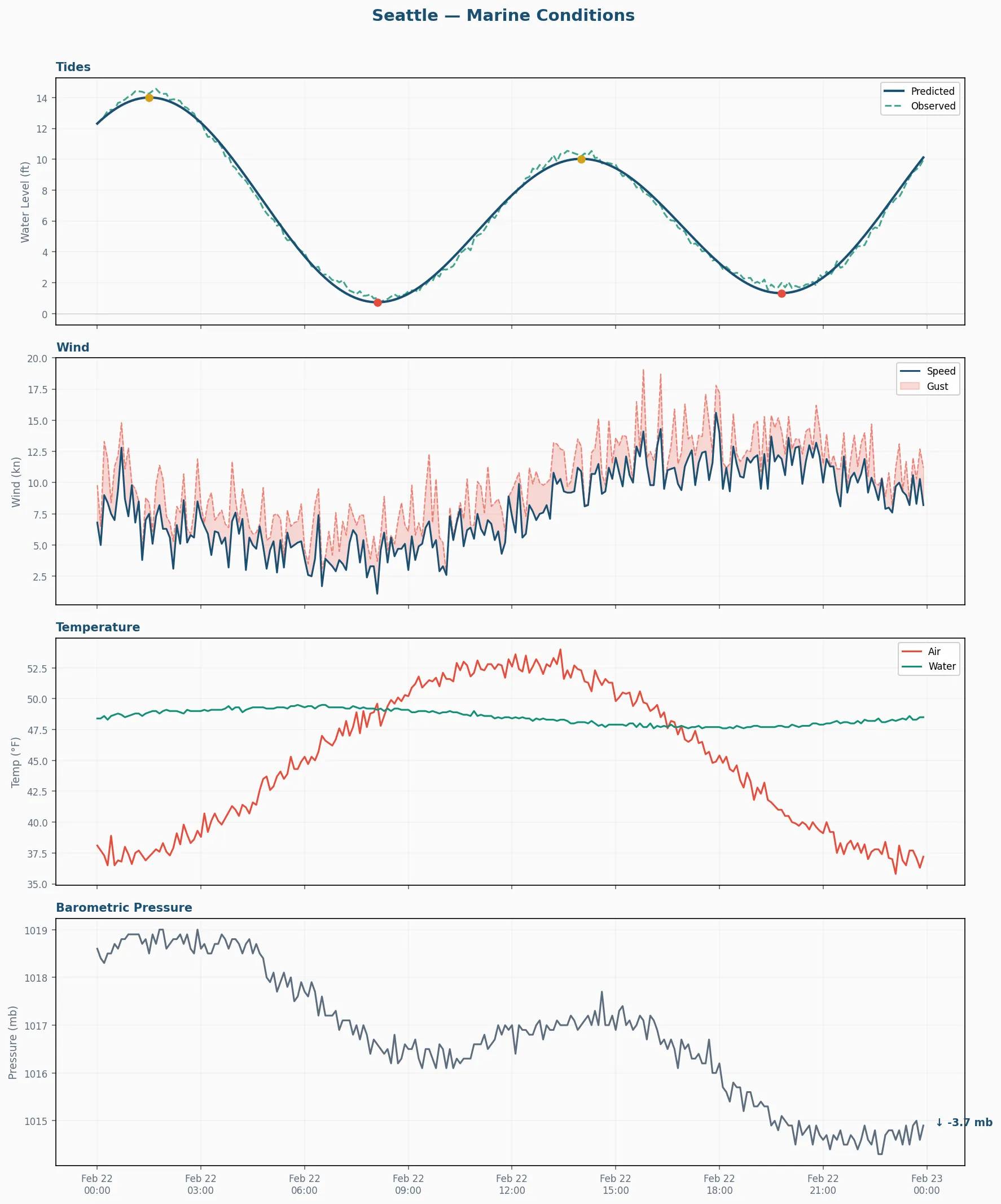
Each panel draws from a different NOAA data product. If a station doesn’t have a particular sensor (some lack wind gauges, for example), that panel is simply omitted rather than showing empty space.
The assistant called visualize_conditions for station 9447130 with a 24-hour window. This fetches tide predictions, observed water, wind speed/direction/gusts, air and water temperature, and barometric pressure — then renders them into a 4-panel layout.
{ "station_id": "9447130", "hours": 24, "format": "png"}Dashboard panels
Section titled “Dashboard panels”- Tides — Predicted water levels with observed overlay and H/L markers
- Wind — Speed and gust readings in knots with direction
- Temperature — Air and water temperature traces
- Pressure — Barometric pressure with trend indication
Choosing a format
Section titled “Choosing a format”PNG — quick visual check
Section titled “PNG — quick visual check”PNG returns an inline image directly in the conversation. No files to manage, no browser to open. Best for quick checks during a planning conversation.
HTML — interactive exploration
Section titled “HTML — interactive exploration”“Can I get that as an interactive chart instead?”
HTML format saves a Plotly chart to artifacts/charts/ and returns the file path. The filename includes the station ID, chart type, and UTC timestamp:
artifacts/charts/9447130_tides_20260222_143000.htmlInteractive charts support panning, zooming, hovering for exact values, and toggling individual traces. They’re useful when you need to examine a specific time window closely or share the chart with someone.
Combining charts with analysis
Section titled “Combining charts with analysis”A common workflow:
“Check conditions at Seattle and give me a visual summary”
- The assistant runs
marine_conditions_snapshotto get raw numbers and spot anything notable - It generates a
visualize_conditionsdashboard so you can see the full picture - If the tide panel shows something interesting, it follows up with a focused
visualize_tideschart over a longer window
For fishing trip planning, a 48-hour tide chart with the observed overlay gives you both the forecast and a visual check on how well predictions have tracked reality over the past day.